once again, just got these from phil, not confirmed as real or fake, but the match up with the descriptions on icethetics

Quote:
We also have new details on the Sabres' new third jersey. It's royal blue and celebrates the history of Buffalo hockey with a vintage white script across the chest inspired by the old Buffalo Bisons club. Beneath the script and set to the right side is the Sabres' 40th anniversary mark — the retro logo with 19 and 70 inside the blue circle.
The striping is somewhat unusual. Both the sleeves and bottom of the sweater feature two sets of yellow double-stripes — for a total of four stripes each around the sleeves an waist, perhaps symbolic of each decade the team has existed. The collar is yellow with vintage white laces.

Quote:
Most important, the stripes around the waist are reversed. Gold should be in the middle, with blue/silver above and below. It is different from the original '70s jersey in that regard.
Also, while there is thin silver piping running up the sides of the sweater, it's not nearly as heavy-handed as what you see in the viral image. And of course the image is blurry, as you would expect for something of this nature. So I can't see whether it has the silver stripes around the waist and sleeves. The real thing does, just like the new home jersey.
Also, some have asked about the silver "armpits." I haven't seen that part of the white sweater so I can't answer that. My guess would be that it mirrors the blue one, so it probably will.
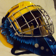
jersey pics from twitter
The white one is beautiful. However, I am somewhat disappointed that they switched the waist stipes around. The outside stripes should definitely be yellow, and the big middle one should be blue.
The 3rd I'll reserve judgment for until I see the back.