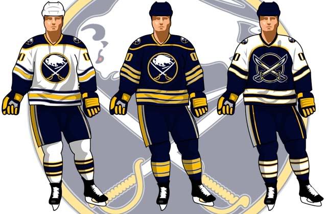
with Quinns news of slug-less sabres after this year i decided to throw this up (i made a new template for jersey designs and wanted to try things out).
im still having trouble coming up with a good looking third. any suggestions.
http://www.sabresjunkie.com/forum/ |
|
| 2010-2011 mock-ups http://www.sabresjunkie.com/forum/viewtopic.php?f=6&t=384 |
Page 1 of 2 |
| Author: | Wozniak [ Sat Oct 03, 2009 3:59 pm ] |
| Post subject: | 2010-2011 mock-ups |
with Quinns news of slug-less sabres after this year i decided to throw this up (i made a new template for jersey designs and wanted to try things out). im still having trouble coming up with a good looking third. any suggestions. |
|
| Author: | Montalo [ Sun Oct 04, 2009 5:26 pm ] |
| Post subject: | Re: 2010-2011 mock-ups |
interesting im not too sure about the yellow stripe on the dark jersey i do like the third, but out of curosity what would a third similar to the dark, but with white shoulders look like and, why did you change the pant stripe for the third? overall very nice though |
|
| Author: | ironyisadeadscene [ Sun Oct 04, 2009 5:32 pm ] |
| Post subject: | Re: 2010-2011 mock-ups |
did you notice ray emerys russia team jersey? i like the bands in the front on the bottom that dont wrap all the way around the jersey.  and the chick, she can keep her jersey. |
|
| Author: | Wozniak [ Sun Oct 04, 2009 6:47 pm ] |
| Post subject: | Re: 2010-2011 mock-ups |
the Yellow stripes on the dark jersey are the same as they are on the current third. i just edited that a bit by removing the piping on the sides and the gray area under the arms. i changed the pants to match the jersey more. since the third jersey played up the white and blue more then the yellow keeping the pants the same as on the other two looked off. when i was working on the third i tried keeping the shoulders the same shape as the others, but making them white. i just couldnt find a good combination with the stripes. |
|
| Author: | MakinItLookMean [ Sun Oct 04, 2009 8:04 pm ] |
| Post subject: | Re: 2010-2011 mock-ups |
i definitely would not go with the puck logo and the 2 swords.....that's one of the worst logo's any team has ever put on the front of their jersey in the history of the nhl |
|
| Author: | ironyisadeadscene [ Sun Oct 04, 2009 8:43 pm ] |
| Post subject: | Re: 2010-2011 mock-ups |
bring back the goathead but in current colours. |
|
| Author: | icehound [ Mon Oct 05, 2009 9:26 am ] |
| Post subject: | Re: 2010-2011 mock-ups |
I'd love to see a goofy ultra-retro set of thirds - Something copied from the original multi-stripe rugby style jerseys of the 1890's-1900's, with solid epaulets and drawstrings...And perhaps the word "Buffalo" on the chest in a Coca-Cola type of script, like the Amerks had a few years ago. |
|
| Author: | End The Curse [ Mon Oct 05, 2009 9:36 am ] |
| Post subject: | Re: 2010-2011 mock-ups |
Wozniak wrote: with Quinns news of slug-less sabres after this year i decided to throw this up (i made a new template for jersey designs and wanted to try things out). im still having trouble coming up with a good looking third. any suggestions. Yes, yes, NO! |
|
| Author: | sabresindc [ Mon Oct 05, 2009 10:00 am ] |
| Post subject: | Re: 2010-2011 mock-ups |
End The Curse wrote: Wozniak wrote: with Quinns news of slug-less sabres after this year i decided to throw this up (i made a new template for jersey designs and wanted to try things out). im still having trouble coming up with a good looking third. any suggestions. Yes, yes, NO! +1 |
|
| Author: | Montalo [ Mon Oct 05, 2009 3:16 pm ] |
| Post subject: | Re: 2010-2011 mock-ups |
Wozniak, what program are you using? ps, or something different? |
|
| Author: | Wozniak [ Tue Oct 06, 2009 12:40 am ] |
| Post subject: | Re: 2010-2011 mock-ups |
Montalo: I'm using AI. im not a fan of using ps on things like this. ETC: i agree. MakinItLookMean: i actually like that logo better then the current and the goat head. it has a better shape and got the team back to a more "simple" logo. Ice: ill see what i can do. Irony: im not a fan of that logo in the current colors. it works best in the red and black to play up the shadows. the navy doesnt stand out enough for me. |
|
| Author: | Howie Hodge [ Tue Oct 06, 2009 12:50 am ] |
| Post subject: | Re: 2010-2011 mock-ups |
Wozniak wrote: with Quinns news of slug-less sabres after this year i decided to throw this up (i made a new template for jersey designs and wanted to try things out). im still having trouble coming up with a good looking third. any suggestions. Yes!! Yes, sans the piping on the shoulder. Um, no thank you on the third. For your third, try a home or away jersey in gold. Design it based on your two we're judging. You'll hit a home run if it's done that way, I predict!! 
|
|
| Author: | Wozniak [ Tue Oct 06, 2009 1:44 am ] |
| Post subject: | Re: 2010-2011 mock-ups |
a few more third mock-ups. comments welcome. 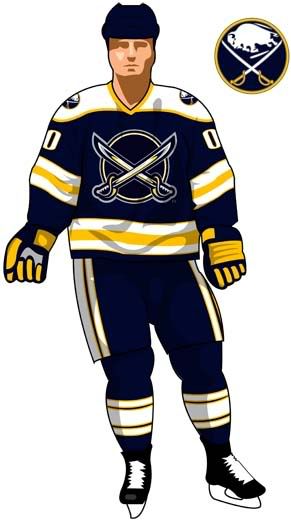 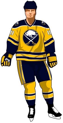 and for Ice. 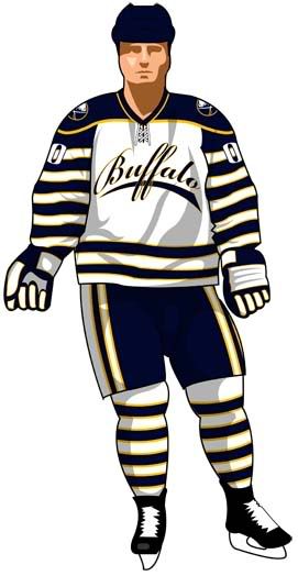
|
|
| Author: | Jim Bob [ Tue Oct 06, 2009 9:00 am ] |
| Post subject: | Re: 2010-2011 mock-ups |
http://www.sportslogos.net/logo.php?id= ... 8lq1grjex7 Take the number off the front, and there you go, IMO. Or, use this logo: 
|
|
| Author: | icehound [ Tue Oct 06, 2009 9:24 am ] |
| Post subject: | Re: 2010-2011 mock-ups |
Wozniak wrote: ...and for Ice. Me Likey Muchly!...That's pretty neat. Can you carry the stripes across the jersey, make the word "Buffalo" white and lighten the blue to a "Royal" or "Ultramarine"? That would be really Harvard Rowing Crewe and Rugby Squad material. Very "turn of the century"... Demanding bastard, ain't I? But I like the look of your initial design - It has a retro-Winter Classic feel to it. |
|
| Author: | SchonyGal [ Tue Oct 06, 2009 11:09 am ] |
| Post subject: | Re: 2010-2011 mock-ups |
Wozniak wrote: ...and for Ice. That's not as bad as thought it would be. All I could think of when Ice said 1890's style was this 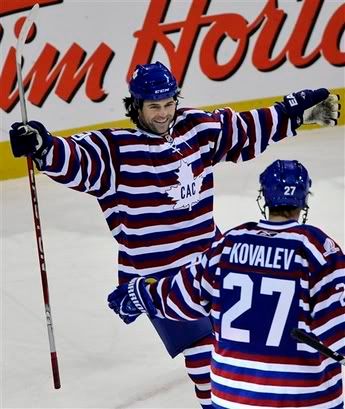 You did a great job of adding enough solids to break up the jail stripes. +1 |
|
| Author: | Howie Hodge [ Tue Oct 06, 2009 11:14 am ] |
| Post subject: | Re: 2010-2011 mock-ups |
Wozniak wrote: a few more third mock-ups. comments welcome. [/img] Now that's what I'm talking about! Stripes are out on pants though.
|
|
| Author: | Jim Bob [ Tue Oct 06, 2009 11:47 am ] |
| Post subject: | Re: 2010-2011 mock-ups |
icehound wrote: Wozniak wrote: ...and for Ice. Me Likey Muchly!...That's pretty neat. Can you carry the stripes across the jersey, make the word "Buffalo" white and lighten the blue to a "Royal" or "Ultramarine"? That would be really Harvard Rowing Crewe and Rugby Squad material. Very "turn of the century"... Demanding bastard, ain't I? But I like the look of your initial design - It has a retro-Winter Classic feel to it. I'd like that better with the bottlecap logo! 
|
|
| Author: | Wozniak [ Tue Oct 06, 2009 1:47 pm ] |
| Post subject: | Re: 2010-2011 mock-ups |
SchonyGal wrote: Wozniak wrote: ...and for Ice. That's not as bad as thought it would be. All I could think of when Ice said 1890's style was this You did a great job of adding enough solids to break up the jail stripes. +1 thank you and when ice said 1890s i had though of either montreal or original ottawa 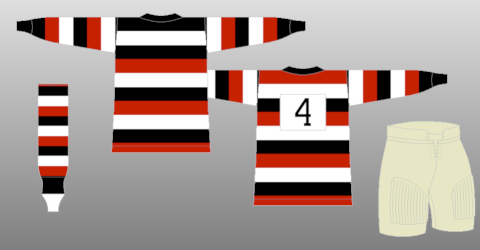 . i tried to find a happy balance between old school and the retro-modern movement that seems to be going through sports now. . i tried to find a happy balance between old school and the retro-modern movement that seems to be going through sports now.
|
|
| Author: | patkane88 [ Tue Oct 06, 2009 10:51 pm ] |
| Post subject: | Re: 2010-2011 mock-ups |
Wozniak wrote: with Quinns news of slug-less sabres after this year i decided to throw this up (i made a new template for jersey designs and wanted to try things out). im still having trouble coming up with a good looking third. any suggestions. Just use the old royal blue jerseys as the thirds. |
|
| Page 1 of 2 | All times are UTC - 5 hours [ DST ] |
| Powered by phpBB® Forum Software © phpBB Group http://www.phpbb.com/ |
|