It is currently Wed May 27, 2026 11:41 pm

All times are UTC - 5 hours [ DST ]


Forum rules


Please click here to view the forum rules


Post new topic Reply to topic  [ 25 posts ]  Go to page 1, 2  Next
Author Message
fan4life61
PostPosted: Fri Jul 22, 2011 4:14 pm 
Offline
PP Quarterback
User avatar

Joined: Fri Sep 11, 2009 11:50 pm
Posts: 1595
Quote:
NHLJets Winnipeg Jets
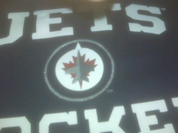
The new logo of the Winnipeg Jets Hockey Club will be unveiled live on www.winnipegjets.com in one hour...
12 minutes ago

_________________
Image
FIGHTER OF THE NIGHTMAN

"on the ice now for buffalo, looking for the pass, and gets it, afinogenov, couldnt get the shot away, now HE DOES, HE SCORES!!!! HOLY MACKEREL ROLE THE HIGH LIGHT FILM, MAXIM AFINOGENOV, WHAT A MOVE!!!!.... thats not fair... that was unbelievable"
-R.J. and Lorenz


Top
 Profile  
 
ironyisadeadscene
PostPosted: Fri Jul 22, 2011 4:41 pm 
Offline
Captain Dynasty
User avatar

Joined: Wed Sep 09, 2009 2:01 pm
Posts: 15390
Location: michigan
Image

_________________
Image


Top
 Profile  
 
ironyisadeadscene
PostPosted: Fri Jul 22, 2011 5:01 pm 
Offline
Captain Dynasty
User avatar

Joined: Wed Sep 09, 2009 2:01 pm
Posts: 15390
Location: michigan
boo-urns

_________________
Image


Top
 Profile  
 
fan4life61
PostPosted: Fri Jul 22, 2011 5:02 pm 
Offline
PP Quarterback
User avatar

Joined: Fri Sep 11, 2009 11:50 pm
Posts: 1595
http://jets.nhl.com/club/news.htm?id=56 ... L|WPG|home

Quote:
True North Sports & Entertainment is proud to unveil today the primary and secondary logos for the Winnipeg Jets Hockey Club which will begin play in the National Hockey League in 2011.

The design for the new logo, which was developed in partnership with Reebok and the NHL, was inspired by the logo of the Royal Canadian Air Force.

“True North Sports & Entertainment felt it was important for the new Winnipeg Jets to develop a strong new identity,” said Mark Chipman, Chairman & Governor of True North Sports & Entertainment. “We felt it was important to authenticate the name Jets and we believe the new logo does that through its connection to our country’s remarkable Air Force heritage, including the rich history and relationship that our city and province have enjoyed with the Canadian Forces.”

True North Sports & Entertainment would also like to thank the Department of National Defence for their assistance in the process.

“We have always had a close relationship with 17 Wing throughout the years, dating back to our annual Manitoba Moose Military Night,” said Dorian Morphy, Senior Director, Marketing & Brand Management of True North Sports & Entertainment. “We are thrilled to be able to continue this relationship in a significant way. The design cues for the plane were inspired by the military jets flown by the Air Force over the years. So not only were we able to establish a new identity for our brand, but we were able to maintain a traditional, time honoured look to the logo.”

The Winnipeg Jets will unveil their uniforms and uniform colors at a later date.

Fans can purchase Winnipeg Jets hats, t-shirts, and kids wear IMMEDIATELY at the new team store “Jets Gear”, formerly known as “Off The Rack” Moose Store, located at the corner of Portage & Hargrave. The store will be open tonight until 10:00 p.m., tomorrow, Saturday, July 23rd between 10:00 and 6:00 p.m. and then on Sunday from noon to 5:00 p.m.


Image

_________________
Image
FIGHTER OF THE NIGHTMAN

"on the ice now for buffalo, looking for the pass, and gets it, afinogenov, couldnt get the shot away, now HE DOES, HE SCORES!!!! HOLY MACKEREL ROLE THE HIGH LIGHT FILM, MAXIM AFINOGENOV, WHAT A MOVE!!!!.... thats not fair... that was unbelievable"
-R.J. and Lorenz


Top
 Profile  
 
Crosscheck
PostPosted: Fri Jul 22, 2011 5:53 pm 
Offline
Sober enough to run a server
User avatar

Joined: Wed Sep 09, 2009 3:10 am
Posts: 7477
Location: 2,568 miles from the F'n arena
not too bad compared to the last one...although I don't really like the inclusion of a maple leaf...

_________________
Hold my beer and watch this...


Top
 Profile  
 
Stuuuuuuu
PostPosted: Fri Jul 22, 2011 6:08 pm 
Offline
Franchise Defenseman
User avatar

Joined: Fri Sep 11, 2009 9:09 pm
Posts: 2876
Location: Portland, Oregano
It's sort of Windsor Spitfires meets Mississauga St. Michael's Majors.


Top
 Profile  
 
BagBoy
PostPosted: Fri Jul 22, 2011 7:10 pm 
Offline
Face-Off Specialist
User avatar

Joined: Sun Oct 11, 2009 3:26 pm
Posts: 713
Location: Greensboro, NC via 14052
Crosscheck wrote:
not too bad compared to the last one...although I don't really like the inclusion of a maple leaf...

No offense, but I don't think their marketing department was targeting you! The maple leaf should go over well in Canada, although it'll be interesting to see how many Leafs fans claim copy-cat.

_________________
This time, like all times, is a very good one, if we but know what to do with it.
--Emerson


Top
 Profile  
 
bigC24
PostPosted: Fri Jul 22, 2011 7:41 pm 
Offline
Two-Way Center
User avatar

Joined: Sat Sep 19, 2009 8:30 pm
Posts: 763
I was ready to say "I LOVE IT!" but I'm kind of unsure. Obviously the jersey will probably make or break my opinion of it, but for now... meh.


Top
 Profile  
 
sabres1996
PostPosted: Fri Jul 22, 2011 8:21 pm 
Offline
Face-Off Specialist
User avatar

Joined: Sat Dec 19, 2009 2:38 pm
Posts: 723
Location: West Seneca, New York
I LOVE this logo, and I think the Maple Leaf gives it a little nice touch. :)

_________________
Sophomore Bitches! Class of 2014!
R.I.P. Molly B. 5/28/96-5/23/11
Image


Top
 Profile  
 
Wozniak
PostPosted: Fri Jul 22, 2011 8:44 pm 
Offline
Franchise Defenseman
User avatar

Joined: Thu Sep 10, 2009 1:11 am
Posts: 2864
Location: Chicago
i like the leave in the primary logo a lot but i dont think its necessary to have it in the word mark.

_________________
Check out my website: http://www.artistzero.com

"That wasn't very nice...I do believe you killed my hat."

Driver of the FIRE LINDY RUFF Bandwagon since 2008.


Top
 Profile  
 
Crosscheck
PostPosted: Fri Jul 22, 2011 9:31 pm 
Offline
Sober enough to run a server
User avatar

Joined: Wed Sep 09, 2009 3:10 am
Posts: 7477
Location: 2,568 miles from the F'n arena
I understand why it's there and who the market is, and it makes perfect sense to me until I remember there's another team in the league named the Maple Leafs with the same symbol on their sweaters.(to be honest, it most reminds me of the red maple leaf on a molson bottle...maybe they got an advertising deal ;) )

Not hating on Canada, I just don't like the use of the leaf...I do like the modern jet and the side patch that looks pilot wings. I also like the colors.


Wozniak wrote:
i like the leave in the primary logo a lot but i dont think its necessary to have it in the word mark.

I can go along with this.

_________________
Hold my beer and watch this...


Top
 Profile  
 
Montalo
PostPosted: Fri Jul 22, 2011 10:13 pm 
Offline
PP Quarterback
User avatar

Joined: Fri Sep 11, 2009 10:09 pm
Posts: 1631
Location: Buffalo, NY
Crosscheck wrote:
I understand why it's there and who the market is, and it makes perfect sense to me until I remember there's another team in the league named the Maple Leafs with the same symbol on their sweaters.(to be honest, it most reminds me of the red maple leaf on a molson bottle...maybe they got an advertising deal ;) )

Not hating on Canada, I just don't like the use of the leaf...I do like the modern jet and the side patch that looks pilot wings. I also like the colors.


Wozniak wrote:
i like the leave in the primary logo a lot but i dont think its necessary to have it in the word mark.

I can go along with this.

montréal had it in like, 1910s

_________________
PSA: I am an overly sarcastic person. If you take me at my word, then i will most likely anger and offend you.


Top
 Profile  
 
Wozniak
PostPosted: Sat Jul 23, 2011 2:03 am 
Offline
Franchise Defenseman
User avatar

Joined: Thu Sep 10, 2009 1:11 am
Posts: 2864
Location: Chicago
Montalo wrote:
Crosscheck wrote:
I understand why it's there and who the market is, and it makes perfect sense to me until I remember there's another team in the league named the Maple Leafs with the same symbol on their sweaters.(to be honest, it most reminds me of the red maple leaf on a molson bottle...maybe they got an advertising deal ;) )

Not hating on Canada, I just don't like the use of the leaf...I do like the modern jet and the side patch that looks pilot wings. I also like the colors.


Wozniak wrote:
i like the leave in the primary logo a lot but i dont think its necessary to have it in the word mark.

I can go along with this.

montréal had it in like, 1910s

...your point?

_________________
Check out my website: http://www.artistzero.com

"That wasn't very nice...I do believe you killed my hat."

Driver of the FIRE LINDY RUFF Bandwagon since 2008.


Top
 Profile  
 
Skyline_BNR34
PostPosted: Sat Jul 23, 2011 2:30 am 
Offline
Cup Winner
User avatar

Joined: Wed Sep 09, 2009 9:34 pm
Posts: 13019
Location: North Carolina
I like the wording of Winnipeg Jets a lot though.

_________________
CriminallyVu1gar wrote:
No need for violence, just tell her she's got a game misconduct and show her the door.

Rud wrote:
As I said in the GDT, the call on Rivet was horseshit. The Bruins player was holding onto Rivet's stick like it was the last fucking raft on the Titanic.


Top
 Profile  
 
Montalo
PostPosted: Sat Jul 23, 2011 8:25 am 
Offline
PP Quarterback
User avatar

Joined: Fri Sep 11, 2009 10:09 pm
Posts: 1631
Location: Buffalo, NY
Wozniak wrote:
Montalo wrote:
Crosscheck wrote:
I understand why it's there and who the market is, and it makes perfect sense to me until I remember there's another team in the league named the Maple Leafs with the same symbol on their sweaters.(to be honest, it most reminds me of the red maple leaf on a molson bottle...maybe they got an advertising deal ;) )

Not hating on Canada, I just don't like the use of the leaf...I do like the modern jet and the side patch that looks pilot wings. I also like the colors.


Wozniak wrote:
i like the leave in the primary logo a lot but i dont think its necessary to have it in the word mark.

I can go along with this.

montréal had it in like, 1910s

...your point?

just saying that its been done before.

_________________
PSA: I am an overly sarcastic person. If you take me at my word, then i will most likely anger and offend you.


Top
 Profile  
 
AudSabres
PostPosted: Sat Jul 23, 2011 8:37 am 
Offline
Superstar Goalie
User avatar

Joined: Sun Sep 20, 2009 12:35 pm
Posts: 4998
Location: In your head, producing very weird thoughts.
Not too pumped about the use of the Leaf, but after thinking about it and why True North wanted to take the Jets name in a different direction (RCAF), which I approve of and their reasoning for the over all design/rebranding of the logo, I think on the right jersey this could have a chance to take flight.

See what I did there? ;)

Side note, if the Jets come out of the gate and go on a retarded winning streak, Toronto stumbles as usual :lol: and the Jets are branded as, "Canada's team" how many fans do you suppose will be uber pissed that another Canadian team is wearing the Maple Leaf? I can hear Brian Burke and Ron Wilson claiming copyright infringement now.


_________________
If it's a tight squeeze, spit on it! - NyI

He's a middling AHL player who had the good fortune of a drunk arbitrator. - The Squanto re: Tim Kennedy


Top
 Profile  
 
patkane88
PostPosted: Sat Jul 23, 2011 9:45 am 
Offline
Captain Clutch
User avatar

Joined: Sun Sep 20, 2009 1:23 am
Posts: 5129
Location: London, Ontario
I like this logo better then the crappy old logo. I might have to get my self a hat when merchandise is released to the public.

_________________
just call me Brad

Twitter @BUrbanowicz13


Top
 Profile  
 
Los9090
PostPosted: Mon Jul 25, 2011 8:50 pm 
Offline
Superstar Goalie
User avatar

Joined: Wed Sep 09, 2009 11:35 pm
Posts: 4707
Location: Glenville, NY
patkane88 wrote:
I like this logo better then the crappy old logo. I might have to get my self a hat when merchandise is released to the public.

I did like the old logo, but its a new era

_________________
"...they came down into the stands and asked if I knew how to do play by play. I said...No. But. I'll take a shot at it if you want".- Rick Jeanneret


Top
 Profile  
 
ironyisadeadscene
PostPosted: Thu Aug 11, 2011 2:37 pm 
Offline
Captain Dynasty
User avatar

Joined: Wed Sep 09, 2009 2:01 pm
Posts: 15390
Location: michigan
Image

Image

also, about the logo. the influence of the ownership group, true north, is VERY apparent.

_________________
Image


Last edited by ironyisadeadscene on Thu Aug 11, 2011 3:12 pm, edited 1 time in total.

Top
 Profile  
 
Rud
PostPosted: Thu Aug 11, 2011 2:42 pm 
Offline
Superstar Goalie
User avatar

Joined: Fri Sep 11, 2009 6:16 pm
Posts: 4121
Location: Hamburg
Reminds me quite a bit of the old Kings away jersey

_________________
Image


Top
 Profile  
 
Display posts from previous:  Sort by  
Post new topic Reply to topic  [ 25 posts ]  Go to page 1, 2  Next

All times are UTC - 5 hours [ DST ]


Who is online

Users browsing this forum: No registered users and 1 guest


You cannot post new topics in this forum
You cannot reply to topics in this forum
You cannot edit your posts in this forum
You cannot delete your posts in this forum
You cannot post attachments in this forum

Search for:
Jump to:  
cron